Intro
This goal of this project is to add extra details to the items on gallery page of my personal website. Currently there are bright, simple graphics for each project but there are no titles or any information about the projects available to the user.
User Requirements
For this project, initial research was done to determine what pieces of information are valuable to users when browsing the gallery. For example, do users want to know which projects are recent, or be able to tell whether a project is available on iOS or the web? Answers to those questions determine what content should be visible when the user hovers over each item. Interviews were conducted to answers those questions and find out what users expect to happen when browsing the website on a touch interface where hovering an item is not possible.
See the User Appendix at the bottom of the page for background information on each user.
User 1
User 1 commented that while browsing portfolio galleries, they selected which item to look at next based on the information provided about it. Often this included the graphic associated with it but sometimes they would be looking for specific types of work such as 3D, motion or interface. They mentioned that some portfolio websites had a sort of caption or tagline to draw the user in, but that if the projects were on the smaller end of the scale, the taglines could come off as overselling the work. Finally User 1 stated that in general, they only looked at the newest work, going deeper only if they liked what they saw of the newer stuff.
User 2
User 2’s main priority when browsing portfolios of potential hires was recent work, and work that is related to the position they are hiring for. Without having to click in and out of each project, they wanted the ability to see which projects were relevant to them and skip the unrelated content.
Layout
Based on the research conducted in the previous section, a basic layout was created to address the needs of the users.
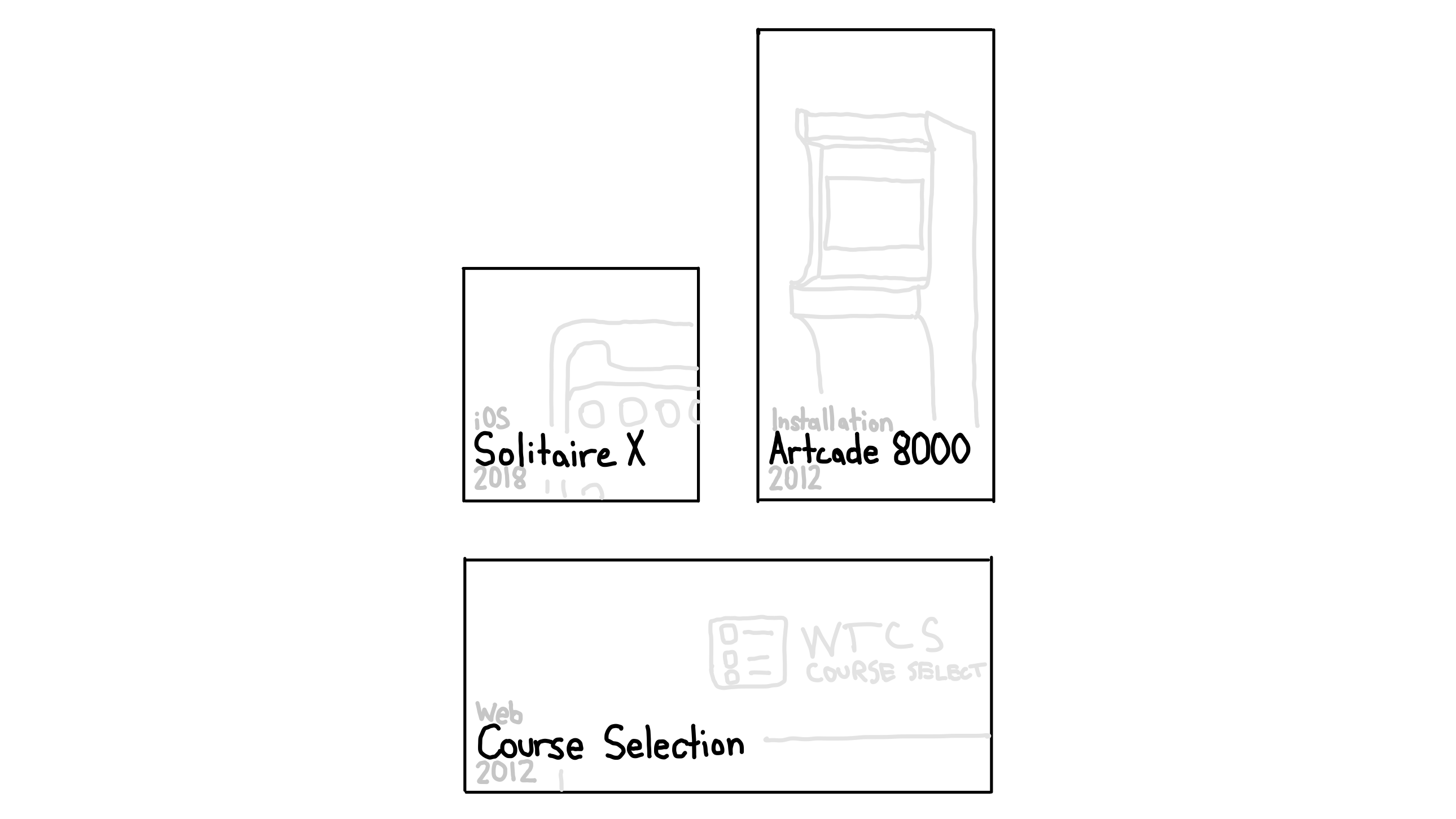
This layout contains a simple left aligned title, along with information about the date and platform/type of the project. Shown above are layouts for the three aspect ratios found in the main gallery
High Fidelity Mockup
In this mockup, both the key colour background and the key image have a black overlay with 75% opacity to reduce the contrast and darken them, leaving room for bright text to stand out on top. I thought that it was important to still show the key image to maintain context when the user hovers and to ensure the connection between the title and the image.
For the text, a variation on Rubik was used, Rubik Bold Italic. The rest of the website uses Rubik in various weights for headings and Karla for content so Rubik was an easy choice for consistency but the Italic variation is not used anywhere else on the site and provides a little extra flair to the information. The project title is set in white providing the greatest contrast, locking it in as the top most element in the visual hierarchy. The secondary information elements are set in the key colour, further increasing the project-colour relationship but also setting it against the faded key colour secures its place as the secondary element in the visual hierarchy.
User Testing
The primary goal for this design is to lower the time it takes to find specific information. In particular this design addresses users with an end goal, something they are looking for on the website. The test is an A/B test comparing having and not having hover information. A user group of 10 people was split into two cohorts A and B. Group A saw the site as it is and Group B saw the site with the hover design implemented. Users were asked to navigate to a specific project by name with users of the same index receiving the same project (ie. A1 and B1 were told to navigate to the same project). Once they were assigned their task a timer was started and when the user successfully completed the test the timer was stopped.
The design was implemented using a copy of the original site with a non-final version of the gallery hover design for each item. Time and the users clicks were recorded via Javascript events (the timer started on page load and ended when the assigned project was clicked on by the user) which were logged to the console and compiled into the table below.
See the User Appendix at the bottom of the page for background information on the user testing group.
Results
| User | Project | Time (s) |
|---|---|---|
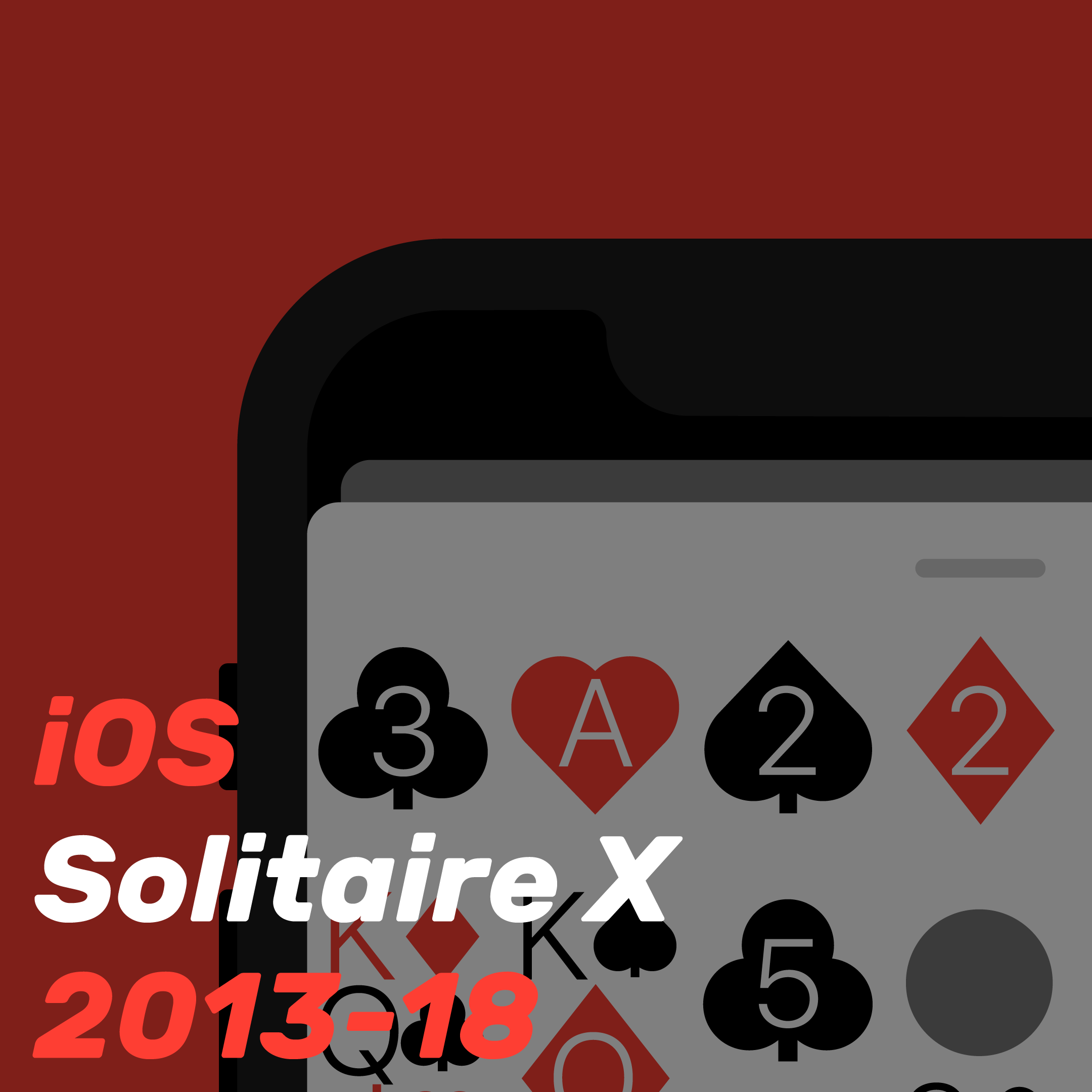
| A1 | Solitaire X | 5.23 |
| B1 | Solitaire X | 4.25 |
| A2 | Canvas Blitting | 23.47 |
| B2 | Canvas Blitting | 6.84 |
| A3 | Rebound | 18.27 |
| B3 | Rebound | 7.03 |
| A4 | Buzzer | 14.65 |
| B4 | Buzzer | 4.20 |
| A5 | Course Selection | 6.88 |
| B5 | Course Selection | 6.43 |
User Testing Conclusion
Based on the data obtained a clear reduction in time is shown. Position/size seemed to affect both numbers with projects that appear higher up or bigger on the page being quicker to navigate to. Additionally, there are two distinct cases where the numbers are closer than the other examples. In the Solitaire X case the title has a clear link to key image making it quicker to navigate to without hover information. Similarly with Course Selection, the key image has a portion of the title in the image making the hover information not effect the time as much.
Peer Critique
The high fidelity design was critiqued by fellow SYDE 542 member Katherine Carras who provided the following feedback:
Liked
- The overall look and functionality
- The use of colour
Didnt Like
- Readability of the text on certain backgrounds
- Potential for overcrowding of the tile (remove unnecessary information)
Peer Critique Conclusion
Based on the feedback provided by Katherine a revised design was created. To address her concerns with the design I darkened the black overlay on the image to provide better contrast with the white and coloured text on top of it. With respect to the potential overcrowding I have not made any changes because I feel that all three pieces of information are invaluable based on the user requirements outlined in the first section. Being able to at a glance pick out recent projects as well as projects of a specific type is the main focus of this design and I think that removing that information would be a regression. However in order to address this, I have slightly reduced the font size of the titles to leave more space.
The final design is presented below:
User Appendix
Since this website is primarily targeted at heavy users of similar products (users who look at other portfolio sites), two users were chosen who browse portfolio websites either for inspiration or as potential hires
User 1
Background
- 22 years old
- Male
- Graduate from York/Sheridan Graphic Design
Use of tech
- Very tech savvy
- Graphic design background
- Heavy, mostly desktop web browsing
Use of the product
- Looks at portfolios almost every day
- Familiar with common portfolio elements and design patterns
- Critical with a high attention to detail
User 2
Background
- 28 years old
- Female
- Background in marketing and digital media
- Has reviewed resumes, websites and conducted interviews
Use of tech
- Comptent computer user
- Digital media background
- Mostly desktop work related web use
- Mostly mobile social related web use
Use of the product
- Browses resumes and portfolios during times of hiring
- Familiar with common portfolio elements and design patterns
- An employers point of view
User Testing Group
- 10 individuals
- Wide range of technological expertise
- Most unfamiliar with the website