Intro
This design aims to address a lack of feedback when a user is navigating around my personal website. Right now, when a user clicks or taps on an item in the gallery, there is no visual feedback and the corrisponding project page is simply loaded. Not only does this not provide feedback to the user but it is a missed opportunity to add some flair, have a more engaging user experience and also to solidify the relationship between the gallery and project pages.
User Requirements
A transition animation such as this is a tough candidate for researching user requirements, it doesn’t have a specific functional purpose and most users expect webpages to simply load the next page when a link is clicked. However, the entire purpose of my personal website is to attract potential employers, as well as document and advertise my work. This is an opportunity to subvert the expectations and stand out from peers with similarly functional websites.
See the User Appendix at the bottom of the page for background information on each user. Over the course of the interviews it became clear that it was hard for the users to pinpoint what they were looking for in animated transitions but that it was easier to talk about examples they didn’t like.
User 1
User 1 made it clear that bad animations could be worse than no animation for them. Bad animations in this case meant anything that took too long or used bad easing curves. Over complicated animations that made the user wait were a problem as were animations without and weight or force behind them. Both of these cases came off as unprofessional for User 1 and immediately soured their experience.
User 2
User 2 was thrown off by animations that served no purpose or had elements moving or rotating for no reason. They emphasized that animations should serve the content and not vice-versa. In User 2’s opinion, the best animations were animations that felt natural and expected with each element moving in an understandable manner.
Layout
Since this design is a transition between two existing layouts, a static layout is not helpful and so a basic motion mockup is more appropriate. A series of static layouts similar to a storyboard and including motion arrows to indicate movement between the frames will give a clear picture of how each part will move in the final design. The simple storyboard can be seen below:
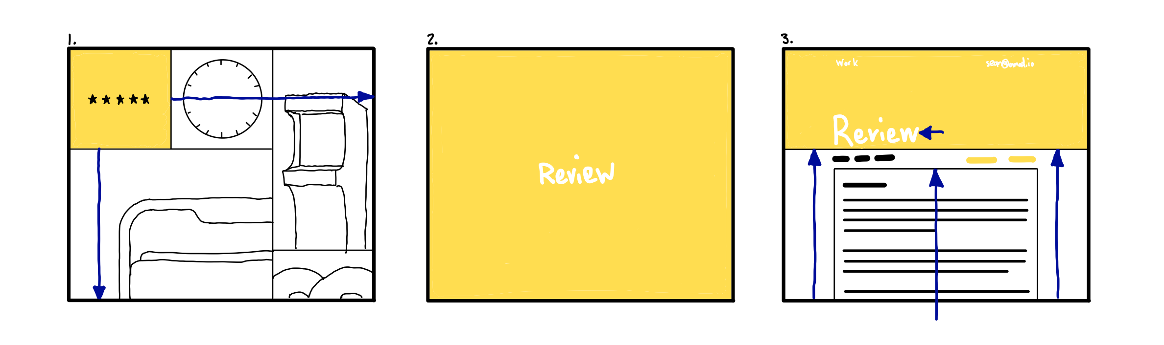
-
The user taps on the item in the top left. The graphic fades out and a centered title fades in as the background colour expands to fill the screen.
-
The intermediate layout can be idled until the page is loaded to mask data and images popping in (assuming page load is fast enough). A spinner or progress bar could be added to indicate network activity
-
The background color height shrinks into its final header position with the page content pinned to the bottom bound of the header giving the impression that the header is dragging it into view. The title shifts to left aligned and the top navigation elements fade in.
High Fidelity Mockup
From the basic motion storyboard, a higher fidelity video was created showing the basic properties of the animation.
User testing
User testing for this design proved rather difficult due to the high cost of implementation and the lack of quantifiable measures so instead the high fidelity mockup was shown to the original two test users for subjective feedback about the animation.
User 1
User 1 suggested that animation took too long but liked the easing choices that were made. They also mentioned that the transition at the start of the animation from the key image to title could use work.
User 2
User 2 was happy with the simplicity of the transition noting the lack of “frills” but noted that something felt “off” about title moving to its final position.
Peer Critique
The high fidelity video was critiqued by fellow SYDE 542 member Katherine Carras who provided the following feedback:
Liked
- The initial “spread” of the colour to cover the page
- Tying the header element to background in the title page
Didnt Like/Suggestions
- The loading state is plain and could use some more motion or project specific elements
Peer Critique Conclusion
The feedback provided by Katherine provided valuable insight into the shortcomings of this design. Addressing this specific feedback would be an immense quantity of work given that there are 9 different projects that would each require independant animation elements. This level of redesign is out of the scope of the peer critique revision but will be kept in mind as after the initial cost of updating the 9 projects, adding a single specific animation for a new project seems to be within reason.
User Appendix
Since this website is primarily targeted at heavy users of similar products (users who look at other portfolio sites), two users were chosen who browse portfolio websites either for inspiration or as potential hires
User 1
Background
- 22 years old
- Male
- Graduate from York/Sheridan Graphic Design
Use of tech
- Very tech savvy
- Graphic design background
- Heavy, mostly desktop web browsing
Use of the product
- Looks at portfolios almost every day
- Familiar with common portfolio elements and design patterns
- Critical with a high attention to detail
User 2
Background
- 28 years old
- Female
- Background in marketing and digital media
- Has reviewed resumes, websites and conducted interviews
Use of tech
- Comptent computer user
- Digital media background
- Mostly desktop work related web use
- Mostly mobile social related web use
Use of the product
- Browses resumes and portfolios during times of hiring
- Familiar with common portfolio elements and design patterns
- An employers point of view
User Testing Group
- 10 individuals
- Wide range of technological expertise
- Most unfamiliar with the website