Intro
This project aims to add additional navigation options to the user to streamline the experience of browsing the work. As it stands when the user is on a project page, in order to see any other projects, the user needs to back out to the gallery and select a new project. This could be simplified by giving users links to other potentially related projects directly on the existing project page. That way when the user is finished with any given project, they are only one click away from reading more
User Requirements
Research was conducted for this project by interviewing potential users about their navigation habits on the project pages of other portfolios in order to get a sense of their issues and needs.
See the User Appendix at the bottom of the page for background information on each user.
User 1
User 1 stated in the interview they don’t actually use this type of navigation much. Instead of project to project navigation they like to back out to the main gallery when they are finished with one project and select another. They liked to compare all the projects together in order to decide what to view next.
User 2
User 2 was interested in reverse chronological viewing of the projects from the most recent to the least recent. When screening potential candidates the importance of their projects diminished with time and being able to instantly jump to the next oldest project helped their
Neither user enjoyed scrolling back up to the top once they were finished reading about a specific project.
Layout
Based on the research conducted in the previous section a basic layout was created
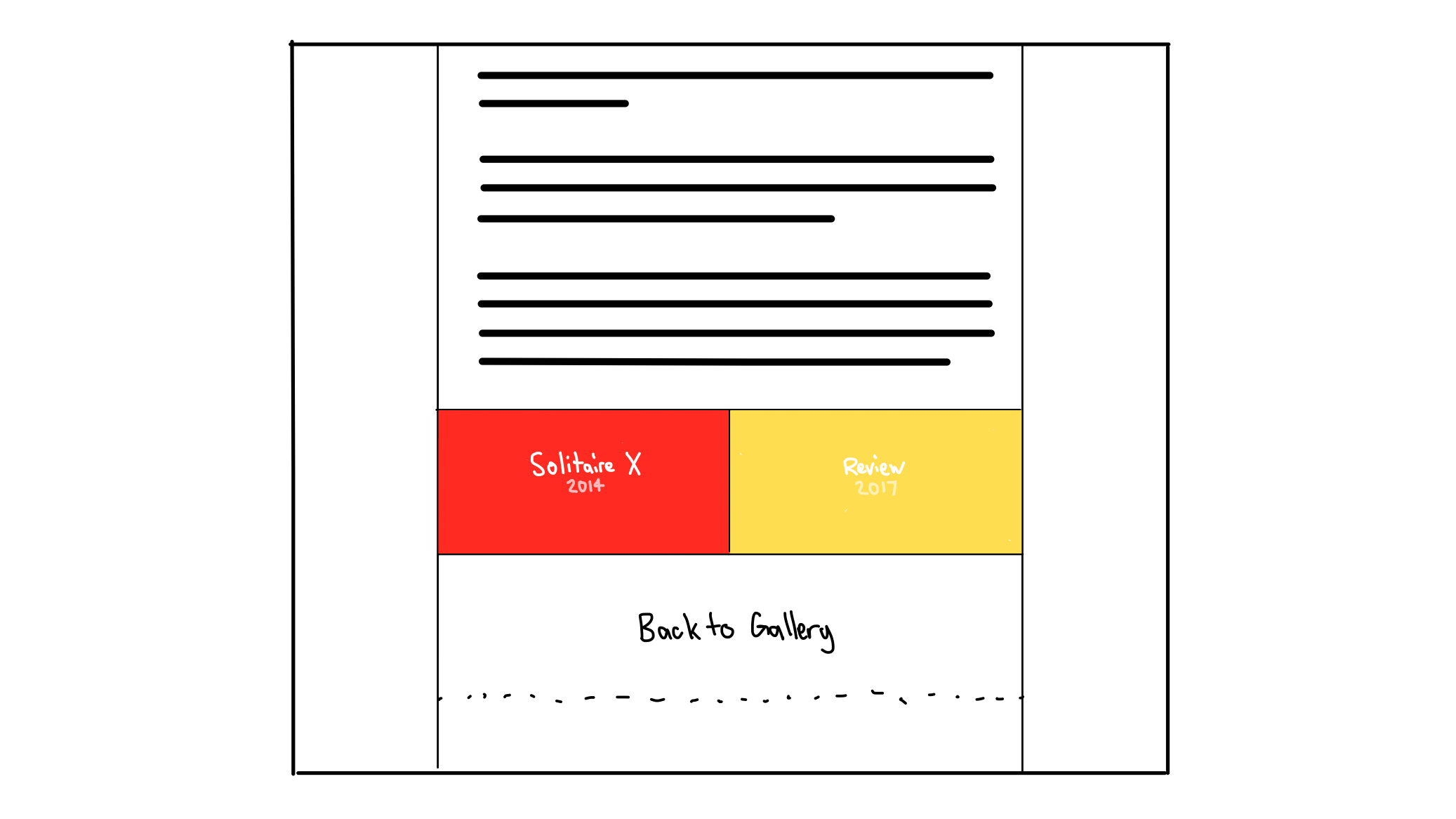
The feedback from User 1 proved valuable in determining that some users do like navigating back out to the gallery and back in to a project. A Back to Gallery button was included for this reason. Above that are the older and newer projects adjacent to the current one in chronological order. This easily allows users to navigate the collection over time.
High Fidelity Mockup
From the low-fi layout that was mocked up above, a high fidelity mockup was designed:
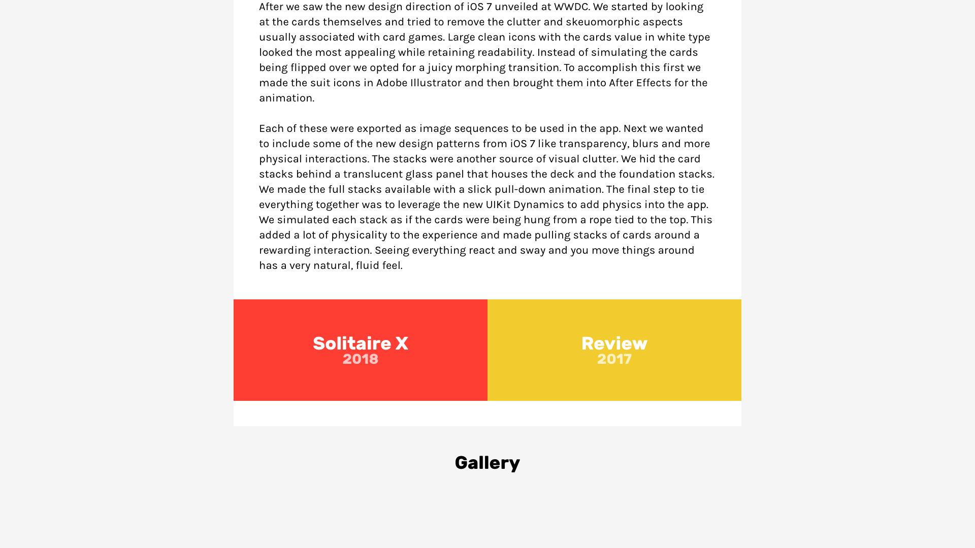
The background for the two navigation buttons is pulled from the key color for the project (the same colour as the background on the gallery page) in order to strengthen the users familiarity with each project since the key image is not used here. Users of the site will build up associations of the project to the key colour through its ubiquitous use.
The fonts were an easy choice. The rest of the website uses Rubik in various weights for headings and Karla for content so Rubik Bold was chosen here for consistency. The project title text has a large 36 point size leaving plenty of space on the side for visual breathing room as well as potential compression for mobile layouts. The year text has a smaller 26 point size and only has a 70% opacity in order to deprioritize it and maintain visual hierarchy.
Finally, the return to gallery link uses a similar 36 point Rubik Bold but is positioned off of the “page” (the lighter centered rectangle that holds the content) in order to indicate that this link is separate from the project contents and is more of a “meta” link and relates to website navigation rather than a link in the content. This is further emphasized by the link not getting the key colour treatment that links in the page content get.
User Testing
The primary goal for this design is to encourage exploration. In particular this design addresses users without an end goal. Since this feature just adds more links to other pages, there isn’t a negative effect to be measured. Instead, the test is designed more around how useful the design is. This test simply asks users to explore the site for 3 minutes and everytime they use one of the new navigation links it is recorded. This should give a good idea of how much use the feature will get.
The user testing was implemented in a similar fashion to the gallery hover user testing. Timing was done manually with a stopwatch and the users clicks were recorded with Javascript events that were logged to the console and compiled into the results table below.
See the User Appendix at the bottom of the page for background information on the user testing group.
Results
| User | Navigation Clicks |
|---|---|
| 1 | 3 |
| 2 | 4 |
| 3 | 2 |
| 4 | 2 |
| 5 | 3 |
| 6 | 1 |
| 7 | 2 |
| 8 | 1 |
| 9 | 5 |
| 10 | 3 |
Conclusion
While it may be difficult to derive meaning from these numbers there are a couple of key insights. Every user used the links at least once which is a good sign that the design is providing utility to every user. While watching the test it also became clear that the links help let the user flow through the content in a more natural way. For example instead of scrolling back up and then clicking back after reading a page, users were flowing right into the next piece of content or back to the gallery directly from where they are.
Peer Review
Fixed back to top/gallery navigation instead of at the bottom, let the user always navigate back Continuous scrollable timeline centered on the current project More project specific flair on links
Peer Critique
The high fidelity design was critiqued by fellow SYDE 542 member Katherine Carras who provided the following feedback:
Liked
- The chronological layout of the links
- The repeated use of key colours from the project
Didnt Like/Suggestions
- The links are bland and could use some more project specific flair in each one
- To continue to enforce the timeline paradigm, make the link section scrollable with the complete set of projects in order
Peer Critique Conclusion
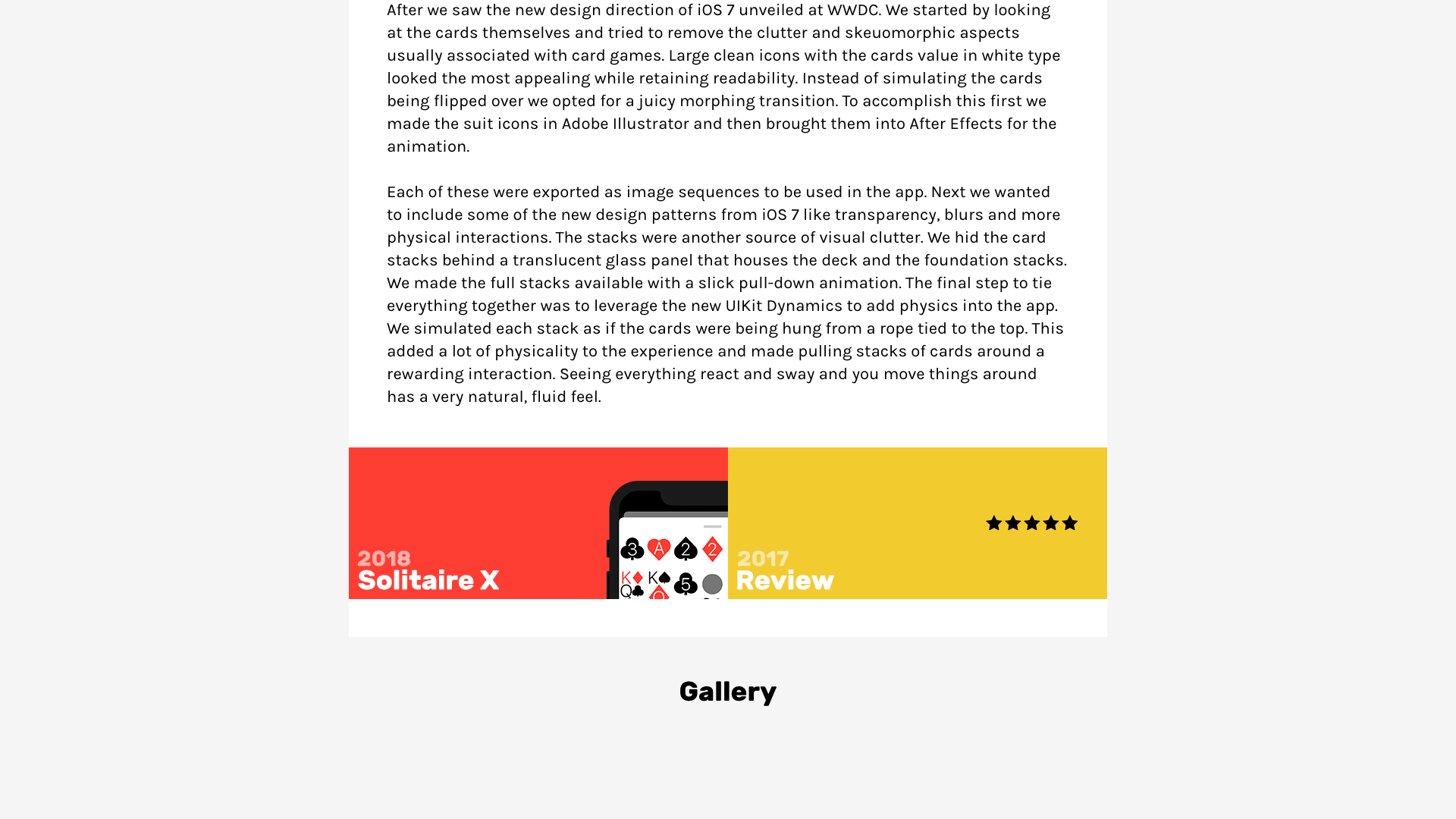
Based on the feedback provided by Katherine a revised design was created. To address her suggestions I changed the design of the links to include the key images from the main gallery page to add variety. The suggestion to make the bottom section a scrolling timeline is very good however it would require a radical redesign of this component and is out of the scope of this design.
By adding the key images and rearranging the text to better resemble the layout of the gallery hover design, it reenforces the connection between the colour, image and title and enhances the consistency across the site while adding some extra flair to these links.
The final design is presented below:
User Appendix
Since this website is primarily targeted at heavy users of similar products (users who look at other portfolio sites), two users were chosen who browse portfolio websites either for inspiration or as potential hires
User 1
Background
- 22 years old
- Male
- Graduate from York/Sheridan Graphic Design
Use of tech
- Very tech savvy
- Graphic design background
- Heavy, mostly desktop web browsing
Use of the product
- Looks at portfolios almost every day
- Familiar with common portfolio elements and design patterns
- Critical with a high attention to detail
User 2
Background
- 28 years old
- Female
- Background in marketing and digital media
- Has reviewed resumes, websites and conducted interviews
Use of tech
- Comptent computer user
- Digital media background
- Mostly desktop work related web use
- Mostly mobile social related web use
Use of the product
- Browses resumes and portfolios during times of hiring
- Familiar with common portfolio elements and design patterns
- An employers point of view
User Testing Group
- 10 individuals
- Wide range of technological expertise
- Most unfamiliar with the website